How Often Do People Get Pulled Over for Speeding in North Carolina?
Visualizing speeding stops in North Carolina
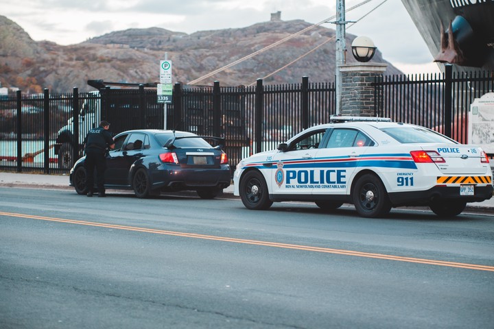 Photo by Erik Mclean on Unsplash
We all have preconceptions about cops and speeding tickets. That small town is a speed trap. There are more cops out on holidays like the 4th of July and Memorial Day, just waiting to pull people over. Don’t get a red sports car because you are more likely to get a speeding ticket. But, do we know if any of these preconceptions are true?
The Stanford Open Policing Project built a repository of traffic stop data. The repository contains data from over 40 states. One of the states with the most complete data is my home state, North Carolina, where there are data from over 24 million police stops.
We’ll take a first look at the NC data in this post. Focusing on stops for speeding, we’ll look at which counties and cities have the most speeding stops per 100 residents and which days see the most stops. We may not answer any of the pressing questions from the introduction, but this post will give us a starting point in answering deeper questions in later posts.
Which counties have the most speeding stops?
We’ll start by looking at speeding stops per 100 residents in each county. Mathematically, this is the number of stops for speeding within in a county divided by the county’s population, times 100. In calculating the number of stops, all departments are included: state troopers, county sheriffs, and local police departments. As long as the stop occurred in the county, it’s counted. Data from 2009 to 2013 - the last year of complete data - are aggregated. Values represent the average yearly stops per 100 residents among these four years.
Map of stops per county
The map below shows each county’s speeding stops per 100 residents. No associations pop out from the map. Rates are not higher along the cost than in the mountains, I-40 counties do not have higher rates, border counties do not have higher rates, etc. Nothing stands out.
Bar chart of stops per county
The bar chart below lets us get a better feel for the distribution in values between counties. We see a large amount of variation. Looking at both extremes in the distribution, Camden’s stops per 100 residents is over 10 times the state rate and Mitchell’s is less than a tenth of the state rate.
Part of the inter-county differences are explained by random variation. And for this factor, we would expect counties with smaller populations to have more random variation. Because of this, it’s not a surprise that small-population counties typically make up the extreme values on both tails of the distribution. However, Camden’s is reeeaaaalllly extreme. Unfortunately, answering the why question is beyond this post’s scope.
Relationship between county population density and number of stops
To further look into the relationship between county populations and the number of stops, the next plot highlights the association between each county’s population density (x-axis) and the number of stops per resident (y-axis). However, there is no association. If you were to overlay a single fit line on the points, that line would be horizontal.
Now, there is more variation in low-population density counties. But again, this is expected because the lower populations bring more randomness.
Which cities have the most speeding stops?
We’ll now move from counties to cities and towns. The data set only includes the stop’s county, it does not record the city. But, the department is included. For example, Winston-Salem Police Department is one department. To look at stops per city, we’ll calculate the number of stops each town or city police department made. Thus, our city aggregates will not include stops by state troopers and county sheriffs. Therefore, we’re looking not at which cities have the highest number of stops per 100 residents, but which local police departments make the most stops per 100 residents.
Only cities with over 5,000 people are included. And of course, we only include cities where we have both population and traffic stop data.
Map of stops per city by local police departments
The map below shows the number of speeding stops per 100 city residents for each police department. The circle size corresponds to the number of speeding stops per 100 residents, with larger circles representing more stops per 100 residents. I’m not sure if there is anything of interest in terms of spatial relationships, but readers can draw their own conclusions.
Bar chart of stops per city
The next graph shows the distribution of stops per 100 residents by local police departments. Like the county distributions, there is a large amount of variation. It’s tempting to tell ourselves just-so stories to explain the variation and those stories might even be correct. For example, Aberdeen and Jacksonville have two of the three highest rates. That’s gotta be those military kids, right? We’ll this could be true. But, further analysis is needed to justify the story.
Days with the highest number of stops
Finally, let’s look at which days have the highest number of speeding stops in the graph below. Memorial Day, 4th of July, and Labor day show spikes in the number of speeding stops. Actually, the Memorial Day spike spans the whole weekend, from Friday to Monday. And the Thanksgiving jump also incorporates Black Friday. Finally, there is an additional spike in late March, which could be spring break related.
As an important caveat, these spikes do not tell us whether we are more likely to get pulled over on the days with spikes. The spikes could occur for two reasons: (1) more people are out driving, and / or (2) police place a greater emphasis on pulling over speeders. We would need data on the number of drivers each day to disentangle the two reasons. And that might be another blog post.
Shane Orr
Education Analyst
Spent six years playing Army, another three as a lawyer, and finally settled into being a data and programming guy.