Using the Veil of Darkness Test to Evaulate Discrimination in Traffic Stops
 Photo by Erik Mclean on Unsplash
The veil of darkness test attempts to uncover racial differences in traffic stop rates. The test, like all tests, has its own weaknesses and should only be seen as additional evidence. It can provide evidence for or against bias in police stops, but should never be taken as the final say.
This post’s purpose is to lay out an example of the veil of darkness test within a Bayesian framework using R. It’s not to prove or disprove discrimination using the test. I leave that delicate task to people more proficient than myself.
What is the veil of darkness test?
Here’s how a group of scholars explained the test:
[The] method starts from the idea that officers who engage in racial profiling are less able to identify a driver’s race after dark than during the day. As a result, if officers are discriminating against black drivers—all else being equal—one would expect black drivers to comprise a smaller share of stopped drivers at night, when a veil-of-darkness masks their race. To account for patterns of driving and police deployment that may vary throughout the day, the test leverages the fact that the sun sets at different times during the year.1
Let’s say it’s dark at 7 p.m. for a third of the year, light for a third of the year, and kind-of dark for a third of the year. We want to compare the percentage of all drivers pulled over who are Black and when it’s light at 7 p.m. against the percentage of all drivers are pulled over who are Black when it’s dark at 7 p.m. If a larger percentage are pulled over when it’s light we have some evidence of racial bias.
With that out of the way, let’s get started.
Setup
library(glue)
library(vroom)
library(modelr)
library(tidycensus)
library(lubridate)
library(highcharter)
library(scales)
library(widgetframe)
library(suncalc)
library(tigris)
library(sf)
library(rstanarm)
library(tidybayes)
library(gt)
library(ggridges)
library(tidyverse)
Custom functions for analysis
# custom functions --------------------------

# create ggplot theme for this post
post_theme <- theme_minimal() +
  theme(legend.position = 'bottom',
        plot.title = element_text(size = 11),
        plot.subtitle = element_text(size = 10),
        axis.title = element_text(size = 10))

theme_set(post_theme)

# standard credits to all to all high charts plots

# credits to be used on all plots
add_credits <- function(hc) {
  hc %>%
    hc_credits(
      enabled = TRUE,
      text = "Data source: The Stanford Open Policing Project | US Census Bureau Pop. Estimates",
      href = FALSE
  )
}

scatter_stops_per <- function(df, second_race, plot_title, y_title) {

  # scatter plot of stops per 100 residents for white and black / Latinx drivers
  # second_race is the race to compare with white

  # max axis point
  max_point <- 100

  # find out if white or minority group is higher, used for colors above or below line
  df[['diff']] <- ifelse(df[['white']] < df[[second_race]], 1, 0)

  # assign color to each row
  color_palette <- c('#4e79a7', '#f28e2b')
  df[['colors']] <- colorize(df[['diff']], color_palette)

  # tooltip
  scatter_tooltip <- "<b>{point.county_name}</b><br>
                      Stops per 100 residents (Black): <b>{point.black}</b><br>
                      Stops per 100 residents (White): <b>{point.white}</b><br>
                      Stops per 100 residents (Latinx): <b>{point.hispanic}</b><br>
                      County population (2013): <b>{point.value_tooltip}</b><br>"

  df %>%
    hchart(
      "bubble",
      hcaes(x = 'white', y = .data[[second_race]], size = value, color = colors)
    ) %>%
    hc_add_series(name = 'line',
                  data = data.frame(
                    x = seq(1, max_point, 1),
                    y = seq(1, max_point, 1),
                    type = 'line',
                    marker = list(enabled = FALSE)
                  )) %>%
    # remove tooltip for line
    hc_plotOptions(line = list(enableMouseTracking = FALSE),
                   bubble = list(opacity = .85,
                                 minSize = "1%", maxSize = "7%")) %>%
    hc_xAxis(min = 1, max = max_point, type = 'logarithmic',
             title = list(text = 'Stops per 100 residents for White drivers')) %>%
    hc_yAxis(min = 1, max = max_point, type = 'logarithmic',
             title = list(text = y_title)) %>%
    hc_tooltip(
        headerFormat = "",
        pointFormat = scatter_tooltip
    ) %>%
    hc_title(text = plot_title)
}

# extract time from date time
time_to_minute <- function(time) {
  # minutes since midnight
  hour(time) * 60 + minute(time)
}

minute_to_time <- function(minutes_since_midnight) {

  # convert minutes created with time_to_minute back to time (hour, minute)

  hour_with_decimal <- minutes_since_midnight/60

  hour_of_day <- floor(hour_with_decimal)

  decimal_from_hour <- hour_with_decimal - hour_of_day

  minute_of_hour <- signif(decimal_from_hour * 60, 1)

  time_of_day <- lubridate::hms(glue("{hour_of_day}:{minute_of_hour}:00"))

  return(time_of_day)

}

get_hdi <- function(df, hdi_colname) {
  # calcualte the highest density interval and place results in a data frame

  column_to_calc_hdi <- df[hdi_colname]

  median_hdci(column_to_calc_hdi, .width = .9) %>%
    mutate(county_time = !!hdi_colname,
           county_time = str_remove(county_time, 'Yes_')) %>%
    select(county_time, estimate = 1, .lower, .upper)
}
Comparing Stops Per 100 Residents Among Racial Groups
Prior to modeling racial bias with the veil of darkness test, let’s take a look at the data. The traffic stop data set comes from the Stanford Open Policing Project and is the same data used in the last post.
Load data
I placed copies of the Stanford Open Policing Project into a Digital Ocean Space. I’m pulling from this Space.
# downlaod traffic stop data --------------------------

# download entire state traffic stop dataset
nc_stops <- vroom(
  'https://shane-datasets.nyc3.digitaloceanspaces.com/traffic-stop/nc/nc_statewide_2020_04_01.csv.gz',
  col_select = -contains('raw'),
  progress = FALSE
)

# get 2009 - 2013 5 year and aggregate
pop_years <- seq(2009, 2013, 1)

n_years <- length(pop_years)

nc_stops <- nc_stops %>%
  mutate(year = year(date)) %>%
  # only keep between years 2010 and 2013
  # 2013 is final full year of stop data
  filter(year %in% !!pop_years)

# save data set so we don't have to download again
write_rds(nc_stops, 'nc_stops.rds')
One way to show racial differences in traffic stops is to compare stops per 100 residents between racial groups. The figure below shows this comparison for all North Carolina counties. The top plot compares Black and White drivers, while the bottom plot highlights Latinx and White drivers. Each point is a county. The diagonal line is the trend we would expect if drivers of different races had the same number of stops per 100 residents.
Of course, there is a lot of data cleaning first to create a data set with county populations and aggregate number of traffic stops per county.
Get county populations and clean population data
We’ll use the tidycensus package to pull county populations from the US Census API. After pulling the data, we’ll clean it so we can combine it with our traffic stop data.
# racial populations by county from census ----------------

# recode integers for dates to years
recode_date <- c(
  `3` = 2010,
  `4` = 2011,
  `5` = 2012,
  `6` = 2013,
  `7` = 2014,
  `8` = 2015
)

# get 2013 overall county populations
county_pop <- get_estimates(geography = "county", state = 'NC',
                            product = 'population',
                            time_series = T,
                            year = 2018) %>%
  # only keep 2013 and only keep population (not density)
  filter(DATE == 6,
         variable == 'POP') %>%
  mutate(NAME = str_remove_all(NAME, ' County, North Carolina')) %>%
  select(NAME, value)

# import population data by county and race
county_pop_race <- get_estimates(geography = "county", state = 'NC',
                                product = 'characteristics',
                                breakdown = c('RACE', 'HISP'),
                                breakdown_labels = T,
                                time_series = T,
                                year = 2018)

# calculate aggregate percentage of population by race
county_pop_agg <- county_pop_race %>%
  # only keep 2010 - 2013
  filter(between(DATE, 3, 6)) %>%
  # aggregate population by race for each county
  group_by(GEOID, NAME, RACE, HISP) %>%
  summarize(agg_pop = sum(value), .groups = 'drop') %>%
  filter(HISP != 'Both Hispanic Origins') %>%
  # make the All Races  race that is Hisp the Hisp race
  mutate(RACE = ifelse(RACE == 'All races' & HISP == 'Hispanic', 'Hispanic', RACE)) %>%
  # only need white, black, and hispanic
  filter(RACE %in% c('White alone', 'Black alone', 'Hispanic'),
         # do not need hispanic breakdown by race
         RACE == 'Hispanic' | HISP == 'Non-Hispanic') %>%
  # remove 'alone' phrase from race
  mutate(RACE = str_remove_all(RACE, ' alone'),
         # make lower case and remove latino to match traffic stops
         RACE = str_to_lower(RACE),
         # remove string so that it matches with traffic stop data
         NAME = str_remove_all(NAME, ' County, North Carolina')) %>%
  # don't need the hispanic column anymore
  select(-HISP)
Combine county populations with aggregate traffic stop data by county
Now, let’s calculate the number of stops in each county for Black, Latinx, and White drivers. We’ll then
# calculate stops per race --------------

nc_stops <- read_rds('nc_stops.rds')

# save list of stop reasons to be uses in text
stop_reasons <- unique(nc_stops$reason_for_stop)

stops_by_race <- nc_stops %>%
  # calculate number of stops by race (numerator)
  group_by(county_name, subject_race) %>%
  summarize(num_stops_race = n(), .groups = 'drop') %>%
  # calculate percentage of stops by race
  # only need three races; not enough data for others
  filter(subject_race %in% c('black', 'white', 'hispanic')) %>%
  # only keep counties with a minimum of 100 stops for each race
  group_by(county_name) %>%
  mutate(min_num = min(num_stops_race)) %>%
  ungroup() %>%
  filter(min_num >= 500) %>%
  drop_na(county_name) %>%
  mutate(county_name = str_remove_all(county_name, ' County'),
         # correct spelling mistake
         county_name = str_replace(county_name, 'Tyrell', 'Tyrrell')) %>%
  drop_na(county_name) %>%
  # combine stops by race percentages and racial population percentages
  left_join(county_pop_agg,
            by = c('county_name' = 'NAME', 'subject_race' = 'RACE')) %>%
  # number of stops per 100 people
  mutate(stops_per = round(num_stops_race / (agg_pop / 100), 2)) %>%
  # convert to wide form where each race is in a different column
  # needed for plotting
  pivot_wider(id_cols = 'county_name',
              names_from = 'subject_race',
              values_from = "stops_per") %>%
  # combine county populations
  left_join(county_pop,
            by = c('county_name' = 'NAME')) %>%
  mutate(value_tooltip = number(value, accuracy = 1, big.mark = ',')) %>%
  # Alleghany is odd outlier, so remove
  filter(!county_name %in% c('Alleghany'))
Plot stops per 100 residents by race
And here is the plot comparing amond racial categories stops per 100 residents.
# scatter plot of race and perc. stops compared to overall perc. pop ----------

bw_stops_title <- 'Stops Per 100 Residents for Black and White Drivers'
bw_y_title <- 'Stops per 100 residents for Black drivers'
bw_scatter_plot <- scatter_stops_per(stops_by_race, 'black', bw_stops_title, bw_y_title)

hw_stops_title <- 'Stops Per 100 Residents for Latinx and White Drivers'
hw_y_title <- 'Stops per 100 residents for Latinx drivers'
hw_scatter_plot <- scatter_stops_per(stops_by_race, 'hispanic', hw_stops_title, hw_y_title) %>%
  add_credits()
frameWidget(bw_scatter_plot, height = 350, width = '75%')frameWidget(hw_scatter_plot, height = 350, width = '75%')For almost all counties in North Carolina, Black drivers are stopped at a higher rate per 100 residents than White drivers. This is shown by almost all of the points lying above the diagonal line for the Black / White comparison chart. The Latinx and White rates, however, are similar as shown by the dots in the Latinx / White graph falling along the diagonal line.
Of course, ending our analysis here is unwarranted. First, this does not account for how often different racial groups drive. It’s comparing stops per 100 residents, not stops per 100 miles driven. Second, we have not accounted for differences in policing patterns. In general, police patrol Black neighborhoods more frequently than White neighborhoods. Therefore, the greater police presence could account for the differences in stops per 100 residents.
Although, it’s no vindication of police to explain away the differences in stops per 100 residents by saying that their neighborhoods are more heavily patrolled. This simply kicks the bias up a step to the level of the deployment of policing assets. Finally, drivers within different racial groups may just drive differently.
The Veil of Darkness Test in North Carolina
The model
We’ll now apply the veil of darkness test with a Bayesian logistic regression model. We’ll use the model to predict a driver’s race and then compare the probability that the driver is Black at a given time when it is dark outside to the probability at the same time when it is daylight. The data set includes all stops in North Carolina’s 40 largest counties between 2009 and 2013. For modeling, we are only using times of the day that experience both daylight and darkness. This is from 5:24 P.M. to 8:21 P.M.
The model’s predictors are:
- Time of day (minute) that the stop occurred, with a natural spline.
- Driver’s age, with a natural spline.
- Driver’s sex
- Year as a categorical variable (2009- 2013).
- Whether it is dark outside at the time of the stop as a categorical.
- County as a fixed effect (We should ideally use county within a hierarchical model, but the hierarchical model took too long to run and I gave up!)
- Interaction term between whether it is dark and county. The interaction term is needed because we want to break the results down by county.
As a regularization tool, all coefficients containing counties - whether the interaction term with counties or just counties alone - have Student T priors with a scale of 1. That said, we have so much data that priors make little difference.
The outcome variable is the driver’s race. Since logistic regression models require the outcome to be discrete (take one of two values), I filtered the data to only include Black and White drivers.
Creating model’s data set
The veil of darkness test requires a lot of data cleaning and pre-processing. Most of the work centers on incorporating sunset and dusk times for each day and county, and then figuring out how many minutes after or before dusk a stopped occurred.
The proceeding code block starts by importing each county’s shape file using the tigris package. Each county’s centroid - it’s center in latitude and longitude - is then calculated using the shape file. We then use the suncalc package to calculate the time of sunset and dusk for each county centroid on each day of the year.
# create dataset for veil of darkness test -----------------------

# get centroid of every county
# we will use this centroid to figure out the county's time of sunset and dusk for each day

# get county shapefiles and centroids
nc_counties <- counties(state = 'NC', cb = T)

# find centroid of each county by using it's boundaries
nc_counties$lon<-st_coordinates(st_centroid(nc_counties))[,1]
nc_counties$lat<-st_coordinates(st_centroid(nc_counties))[,2]

# drop shapefile column
nc_counties$geometry <- NULL

nc_counties <- nc_counties %>%
  ungroup() %>%
  select(GEOID, NAME, lon, lat)

# get sunlight times for each county

# extend dataset to include a county row for each day
# neede because function to calcualte sunset requires date column in dataframe
days_seq <- seq(as.Date(min(nc_stops$date)), as.Date(max(nc_stops$date)), "days")

nc_counties_sunset <- map_df(days_seq, function(day) {
  nc_counties %>%
    mutate(date = !!day) %>%
    getSunlightTimes(
      data = .,
      keep = c("sunset", "dusk"),
      tz = 'EST'
    )
}) %>%
  mutate(
    sunset_minute = time_to_minute(sunset),
    dusk_minute = time_to_minute(dusk),
    date = ymd(str_sub(date, 1, 10))
) %>%
  # join county names
  left_join(nc_counties, by = c('lon', 'lat'))

# only keep the 40 most populated counties
most_pop_counties <- county_pop %>%
 arrange(desc(value)) %>%
 head(40) %>%
 .[[1]]
Now, we’ll merge these sunset and dusk times to the traffic stop data set. After merging, we’ll calculate how many minutes before or after dusk a stop occurred and filter the data set to only include times of the day where at some points of the year it was light and at others it was dark.
# merge dusk times with nc stops dataset
nc_stops_veil <- nc_stops %>%
  drop_na(time) %>%
  mutate(county_name = str_remove_all(county_name, ' County')) %>%
  # only keep the 40 most populated counties
  filter(county_name %in% !!most_pop_counties) %>%
  # add sunset and dusk times
  left_join(nc_counties_sunset,
            by = c('county_name' = 'NAME', 'date')) %>%
  # convert date times to integer minutes from midnight
  mutate(
    minute = time_to_minute(time),
    minutes_after_dark = minute - dusk_minute,
    is_dark = minute > dusk_minute
  ) %>%
  ungroup() %>%
  group_by(county_name) %>%
  # find the min and max dusk times for each county
  mutate(
    min_dusk_minute = min(dusk_minute),
    max_dusk_minute = max(dusk_minute),
    is_black = subject_race == "black"
  ) %>%
  filter(
    # Filter to get only the intertwilight period
    minute >= min_dusk_minute,
    minute <= max_dusk_minute,
    # Remove ambigous period between sunset and dusk
    !(minute > sunset_minute & minute < dusk_minute),
    # Compare only white and black drivers
    subject_race %in% c("black", "white")
  ) %>%
  select(date, time, sunset, dusk, contains('minute'), is_dark, everything()) %>%
  drop_na(is_black, is_dark, minute, subject_age, subject_sex, county_name) %>%
  mutate(county_name = factor(county_name),
         year = as.factor(year))

# remove items to save RAM
rm(county_pop_race)
rm(nc_stops)
rm(nc_counties_sunset)
Create model
Now we’re ready to model. First, we’ll create a data set with the needed variables and also create a data set for predictions, which will assume a 20 year old male in 2013.
# create datasets for modeling and prediction -------------------

# variables needed for modeling
vars_for_model <- c('minute', 'subject_age', 'subject_sex', 'county_name', 'is_dark', 'year', 'is_black')

model_df <- nc_stops_veil %>%
  ungroup() %>%
  select(!!vars_for_model) %>%
  drop_na() %>%
  # make categoricals explicit so results are easier to understand
  mutate(is_dark = ifelse(is_dark, 'Yes', 'No')) %>%
  mutate(across(c('subject_sex', 'county_name', 'is_dark', 'year'), ~as.factor(.)))

# dataset to create potential outcomes
# compare differences in probability of getting stops between Black and White drivers
# for each county in 10 minute increments
# use 20 year old male getting stopped
potential_outcome_data <- model_df %>%
  data_grid(
    minute = seq_range(minute, by = 10, pretty = T),
    subject_age = 20,
    subject_sex = subject_sex,
    county_name = county_name,
    is_dark = is_dark,
    year = year
  ) %>%
  filter(subject_sex == 'male',
         year == '2013') %>%
  arrange(is_dark, county_name, year, minute) %>%
  as.data.frame()
And here is our Bayesian logistic regression model.
# create logistic regression model -----------------------

# priors on intercept and coefficients
t_prior_coef <- student_t(df = 5, location = 0, scale = 1, autoscale = TRUE)
t_prior_intercept <- student_t(df = 5, location = 0, scale = 1, autoscale = TRUE)

# bayesian model
mod <- stan_glm(
  is_black ~ is_dark*county_name + splines::ns(minute, df = 4) + splines::ns(subject_age, df = 4) + subject_sex + year,
  data = model_df,
  family = binomial(link = "logit"),
  prior = t_prior_coef, prior_intercept = t_prior_intercept,
  QR = TRUE,
  seed = 123,
  cores = 8
)

# write out to save results, so we don't have to re-run
write_rds(mod, 'mod.rds')
The results
The next plot highlights the applicable model results. It’s the posterior distribution for each county of the percentage point difference between darkness and daylight in the percent of drivers who get stopped that are Black. The predictions assume a 20 year old male driver who is pulled over at 7 p.m. Let’s use an example to better understand.
Let’s say that at 7 p.m. during the time of year when it is dark out the percentage breakdown of those being stopped is as follows:
| Race | Percentage breakdown |
|---|---|
| Black | 49% |
| White | 51% |
Conversely, at 7 p.m. when it is light the percentage breakdown changes as follows:
| Race | Percentage breakdown |
|---|---|
| Black | 45% |
| White | 55% |
The difference in the probability that a driver being pulled over is Black between when it is dark outside and when it is light at 7 p.m.: 49% - 45% = 4 percentage points
In this case, there is evidence of discrimination since Black drivers make up a higher percentage of drivers pulled over when it is dark compared to when it is light outside, keeping the time of day constant.
The values in the plot have the same meaning: positive numbers imply that Black drivers are pulled over more at night. The lines at the ends of the distributions represent 95% credible intervals.
Create posterior distribution of differences
The block below takes the posterior distributions in each county of predictions that a driver is Black when it is dark outside at 7 P.M. and subtracts it from the county posterior distributions of the same probability when it is light outside at 7 P.M. The resulting posterior distribution is what we will plot.
# create predictions from model ---------------------
mod <- read_rds('mod.rds')

post_predictions <- posterior_epred(mod, newdata = potential_outcome_data, draws = 500) %>%
  as.data.frame()

# add decriptive column names to posterior predictions signifying what they represent
potential_outcome_data <- potential_outcome_data %>%
  mutate(descriptive_name = glue("{is_dark}_{county_name}_{minute}"))

colnames(post_predictions) <- potential_outcome_data$descriptive_name

# subtract dark from not dark for all county / minute combinations
dark_predcitions <- post_predictions %>%
  select(starts_with('Yes'))

not_dark_predcitions <- post_predictions %>%
  select(starts_with('No'))

diff_dark_not_dark <- not_dark_predcitions - dark_predcitions

# calcualte hdi for all differences between dark and not dark for each county / time combination
colnames_for_hdi <- colnames(diff_dark_not_dark)
And here are the results.
# use 20 year old male getting stopped at 7 PM

diff_dark_1140 <- diff_dark_not_dark %>%
  # select columns for 7 pm
  select(ends_with('1140')) %>% # .50
  # make column with row ID, useful when pivoting data
  rowid_to_column("ID") %>%
  pivot_longer(cols = -ID, names_to = 'county_id', values_to = 'estimate') %>%
  mutate(county = str_extract(county_id, '_.*_'),
         county = str_remove_all(county, '_')) %>%
  select(-county_id)

# order counties by HDI, so the plots look better
county_order_by_hdi <- diff_dark_1140 %>%
  group_by(county) %>%
  median_hdci(estimate) %>%
  arrange(estimate) %>%
  select(county) %>%
  .[[1]]


diff_dark_1140 %>%
  mutate(county = factor(county, levels = county_order_by_hdi)) %>%
  ggplot(aes(estimate, county)) +
  geom_vline(xintercept = 0, linetype = 2, alpha = .8) +
  stat_density_ridges(
    quantile_lines = TRUE, quantiles = c(0.025, .5, 0.975),
    alpha = 0.7, rel_min_height = 0.05,
    fill = 'deepskyblue', alpha = .25
  ) +
  labs(
    y = NULL,
    x = 'Percentage point difference between darkness and daytime in percentage of drivers being stopped who are Black'
  ) +
  theme_minimal()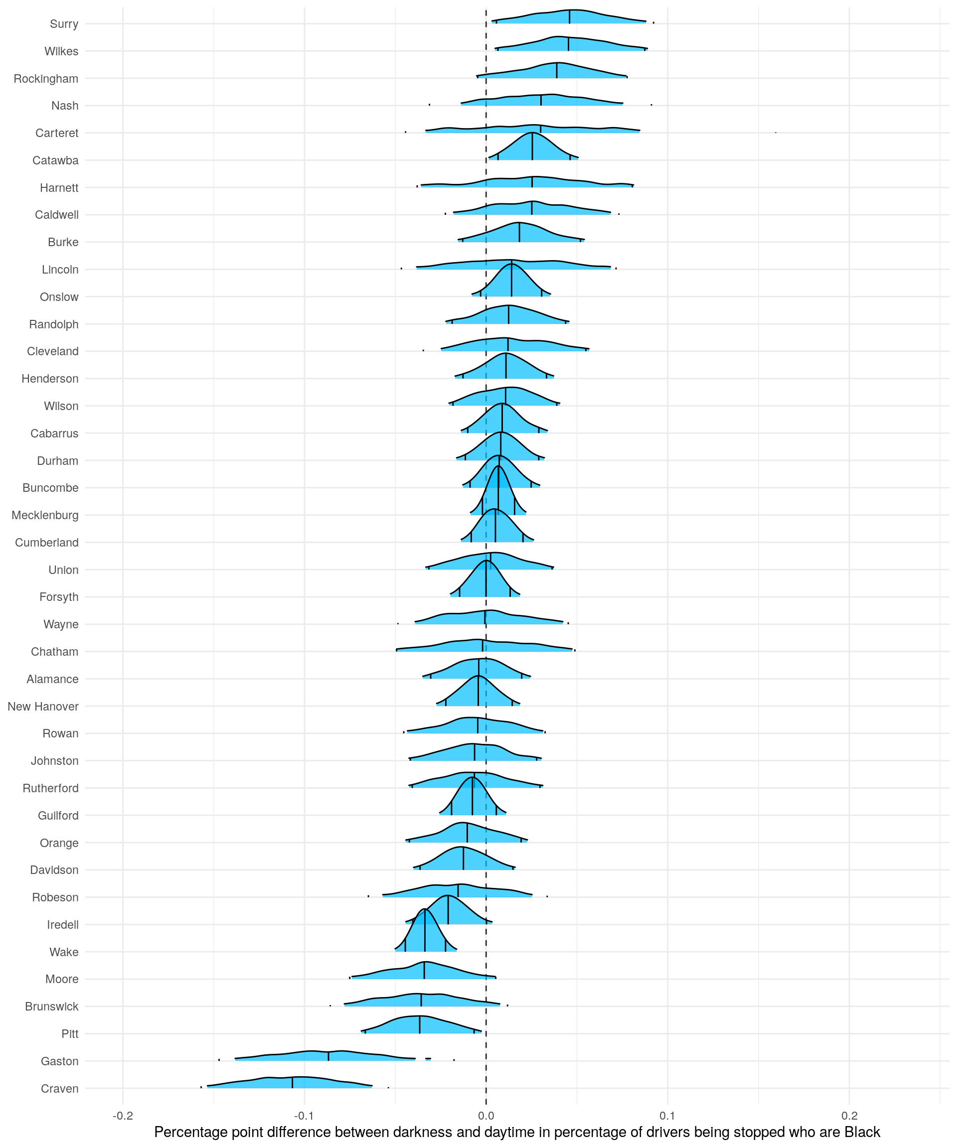
Overall, the results paint a mixed picture. Three counties have 95% credible intervals entirely above zero, while five counties have intervals below zero. These results, which don’t show any trends overall, raise worries about multiple comparison problems. After all, we are looking at 40 counties. It’s not crazy to think that one or two will have large values by chance. Sure, we have a lot of data and we put regularizing priors on the county coefficients; but the worry still lingers.
We can overlay all the posterior distributions to get a picture of the distribution of distributions. The following figure does this. The county-level distributions form a symmetrical, bell-shaped, distribution centered on zero. But, the two counties to the left, Craven and Gaston, separate themselves from the pack a bit.
ggplot(diff_dark_1140, aes(estimate, color = county)) +
  geom_density() +
  geom_vline(xintercept = 0, linetype = 2) +
  xlim(c(-.2, .2)) +
  theme_minimal() +
  labs(x = 'County posterior distributions',
       y = NULL)  +
  theme(
    legend.position = 'none',
    panel.grid = element_blank(),
    axis.text.y = element_blank(),
    panel.border = element_rect(colour = "grey", fill=NA, size=1)
  )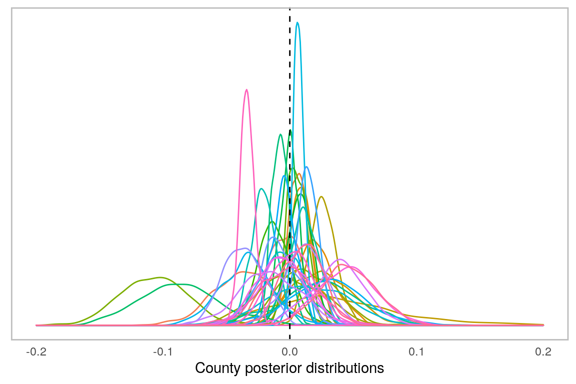
Taking this all together, I’m hesitant to claim that the veil of darkness tests provides strong evidence of discrimination. At most, it could present evidence for the three counties with 95% credible intervals above zero. Plus, the strength of the evidence depends, in part, on the strength of the veil of darkness test as a tool. Let’s turn to the test’s limitations now.
Limitations of the veil of darkness test
The veil of darkness test, like all tests, has its limits. The first is the test’s scope. It’s not trying to discern bias writ-large, but a narrow type of bias: bias when police officers make the quick decision to pull someone over. But, there are multiple entry points of bias with law enforcement. As noted earlier, there might be racial bias is the deployment of law enforcement assets. This bias could feed into disparities in traffic stops without being picked up by the veil of darkness test.
But, the scope is even smaller than this. It only examines police officer bias in a small roughly three hour period when it’s daytime part of the year and nighttime part of the year. Additionally, many streets contain artificial lighting. The veil of darkness test assumes that officers do not know the race of the driver they are pulling over at night. Often, however, this isn’t true.
That said, the test is evidence. Not conclusive evidence, but a data point; part of a larger picture. Conclusively claiming discrimination, or lack thereof, requires more than one study, test, or blog-post. However, each study and test paints part of the picture.
Pierson, E., Simoiu, C., Overgoor, J., Corbett-Davies, S., Jenson, D., Shoemaker, A., & Goel, S. (2020). A large-scale analysis of racial disparities in police stops across the United States.() Nature human behaviour, 4(7), 736-745.↩︎
Shane Orr
Education Analyst
Spent six years playing Army, another three as a lawyer, and finally settled into being a data and programming guy.